Improving e-commerce sales is the Holy Grail for any business that sells online. And predictably, with competition levels high and the sales targets ruthless, some web designers have resorted to less-than-white-hat tactics to boost e-commerce conversions, such as dark patterns and black hat SEO.
But boosting e-commerce sites with link building and SEO doesn’t’t have to be dark and dirty. By getting up to speed on web psychology, designers can create interfaces that are persuasive without being unethical.
What does psychology have to do with web design?
You might be wondering why you need to understand psychology to be a good designer. Basically, psychology is the foundation of persuasive design. In fact, according to conversion optimization expert Jeremy Smith, “in my conversion optimization universe, psychology trumps technique.”
Psychology can have a profound impact on conversions and user success rates – once you become familiar with the subconscious fears and desires behind user behavior, you’ll be better able to channel that behavior through interface design.
Take a look at what retail is doing to gain an understanding of what works in the industry today. Once you know how to sell on Amazon, where shoppers are happy with their experience, you can apply the tactics to your own website. (See also: Getting Started on Amazon, and How to Appeal Your Amazon Suspension) Happy users mean higher conversions, so here are 5 web psychology tricks that web designers should know about.
Trick #1: Forget features, focus on the ‘benefits’
Did you ever hear that old chestnut, “sell the sizzle, not the sausage”? That advice is as applicable for UI designers as it is for Don Draper types. Users and customers are essentially self-centered: as evidenced from the psychology of selling.
Web designers need to realize that users are not on your site to listen to you brag about all the awesome features a product has; they’re there to find out what you can do for them. Help them out with persuasive marketing copy.
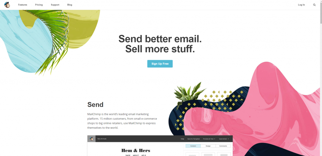
Check out the great example of Mailchimp: their homepage focuses on the product’s 2 key benefits for users – “Send better email. Sell more stuff” – without mentioning features. It’s a powerful message and highly user-centric – which online business doesn’t want to sell more stuff?
Trick #2: Reduce user anxiety by making it all about the group
Imagine you’re at a party and no one’s dancing. It’s hard to get and be the first to shake it, right? That’s how users feel too when they click on a product website. “Is anyone else out there using this product? Is there a good support community or will I be on my own out there? Am I going out on a limb and wasting my money here?”
Not the kind of questions you want users to be asking. Luckily, web designers can overcome this by playing on the herd instinct. People don’t want to be outliers when it comes to spending their hard-earned cash. Let them know they’re not alone by giving testimonials a central role in your eCommerce site.
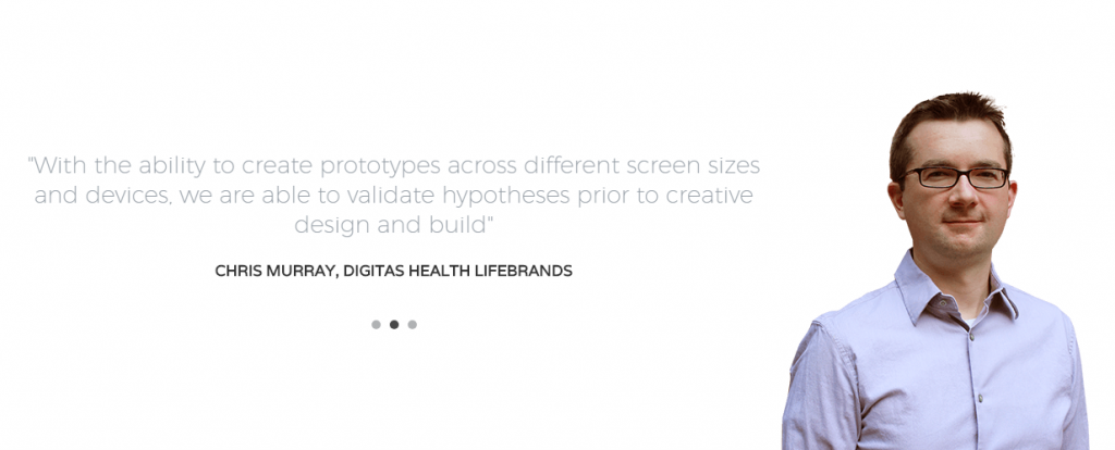
Testimonials humanize the product and make the potential customer feel like they’re joining an established movement rather than taking a risk. For example, on Justinmind we feature testimonials on our homepage, along with photos of our clients. Seeing a friendly face and hearing real stories from our prototyping tool clients helps reduce potential customer outlier anxiety.
Trick #3: Now, ramp up user anxiety
Bet you didn’t expect that one, did you? According to the established tenets of user experience, you should avoid making users anxious at all costs. Well yes, kinda. But what about if users feel anxious because they absolutely positively have to buy your product right now? That kind of ‘positive urgency’ is, according to Kissmetrics, essential is creating “a sense of urgency that will move the buyer forward in the sales cycle.“
How can designers induce this kind of helpful anxiety and get users to convert faster?
- Use color to create visual urgency
- Create scarcity with limited offers
- Create a deadline to induce FOMO (fear of missing out)
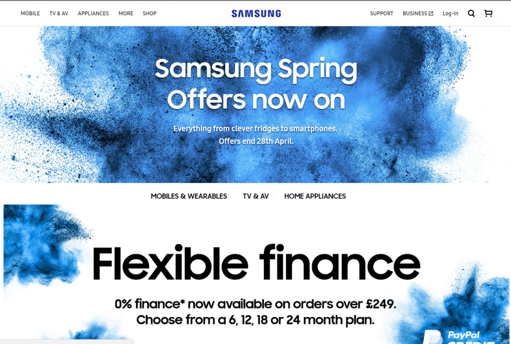
Creating time-limited offers around upcoming events or holidays is a great way to boost conversions, for example. Check out how Samsung does it below:
Creating scarcity, or the perception of scarcity is a well-worn sales tactic that translates well to user interfaces. A “hurry, only a few left!” is guaranteed to get the heart rate up on even the savviest eCommerce customer.
Trick #4: Use real people to direct user gaze
Do you remember we mentioned those friendly faces on Justinmind’s site? Not only do they help potential clients feel part of a group, but they also help direct user attention. Humans react to other human faces; it’s a natural, subconscious and powerful phenomenon. Users have been shown to focus on human faces on a website and immediately assess the emotional state of the face.
UI designers can cash in on this tendency by putting faces close to key action buttons such as Buy Now or See Offers. Or get even smarter and direct the gaze of the face on the website towards your action button – users will naturally direct their gaze that way too. Oh, look, an action button! What a coincidence.

Trick #5: Distill your offer, simplify your user flows
It’s likely that your eCommerce site offers tons of great offers and plenty of navigation paths. After all, you want to show potential customers the full glory of your site right from the get-go. But maybe bombarding them with information isn’t actually the best way to maximize conversions. Interfaces with unclear user flows can repel even the keenest customer. Just try booking a car from Lings Cars if you don’t believe us.
Drop complex interfaces with multiple navigation paths and instead apply the Law of Prägnanz, or Simplicity. As Steven Bradley explains in Smashing Magazine, this design law decrees that users “prefer things that are simple, clear and ordered. Instinctively these things are safer. They take less time for us to process and present less dangerous surprises.”
Here’s how web designers can apply a little Prägnanz in their user interfaces.
- Use repetitive patterns and flows
- Introduce symmetry between UI elements
- Add enough white space
- Using light-weight ‘buy now‘ options over shopping cart flows
For example, take a look at how simple Basecamp’s conversion funnel is. You land on the page and there’s pretty much only one place to go — ‘Start a free trial.’ Heck, it’s free! Why not?
Comments: